For every novel, a font of its own
I've been a designer for nearly as long as I've been a writer, and there's little I love more than a great font. Which is why it can be painful to encounter manuscript submission guidelines that require something like 12pt double-spaced Courier or Times New Roman. Don't get me wrong, I understand why. But I dread working on page after page after page of tired old fonts.
So I don't. At least while drafting, I select a typeface that suits the project I'm writing. It's almost criminal how much I enjoy writing a book set in a beautiful font.
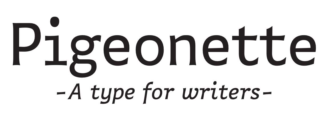
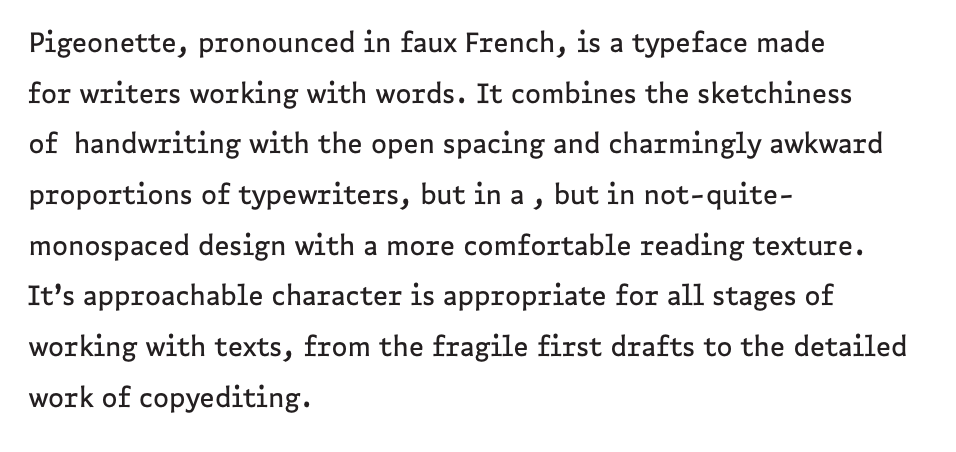
I'm writing my current project, The Dark Age, with Pigeonette, a beautiful, quirky, almost monospace font by Ro Hernández.
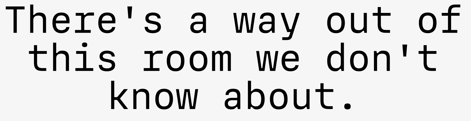
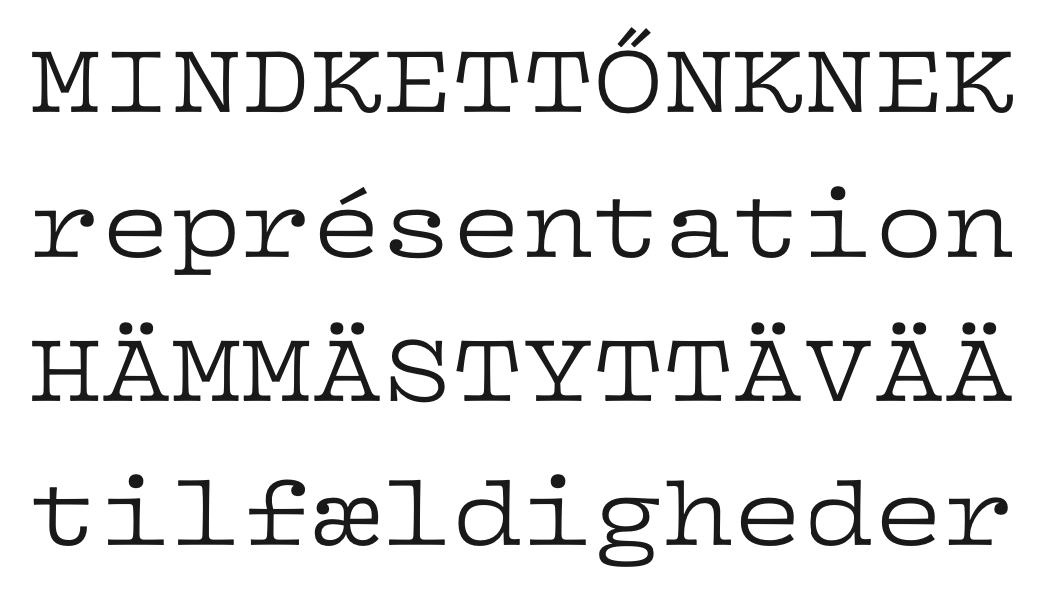
The preceding project (which I can't share yet, but anticipate I'll be able to talk about soon enough) was written with Mass-Driver's MD IO typeface, a sturdy, just-weird-enough monospace font:
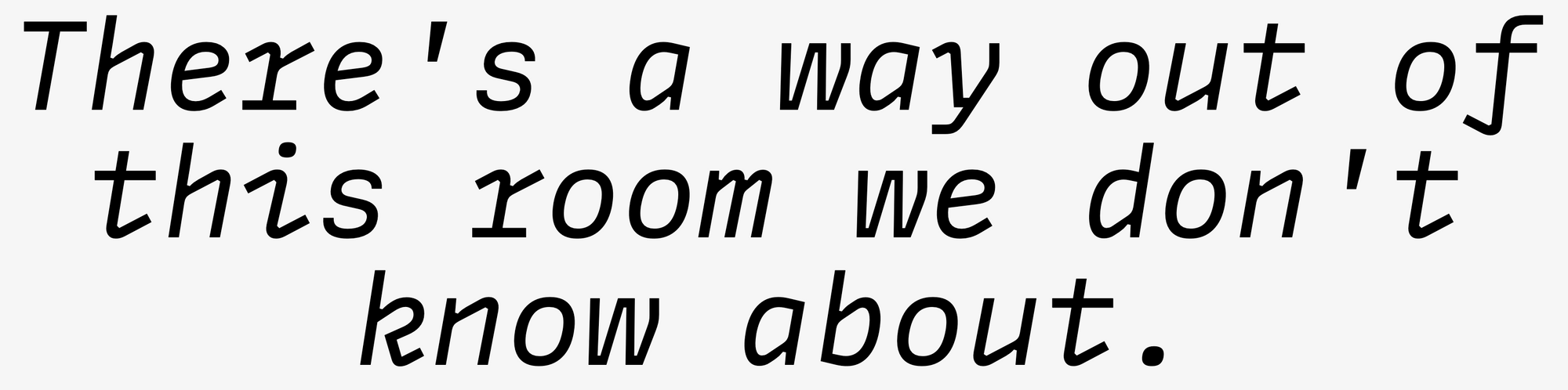
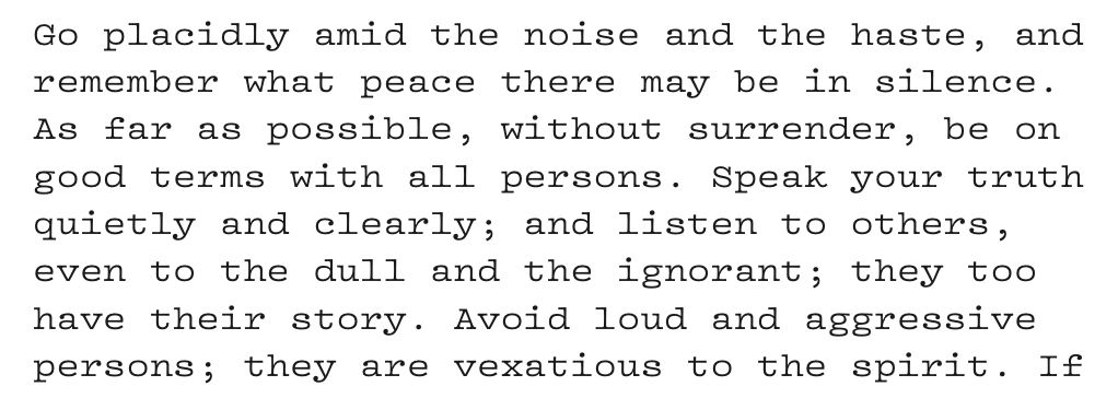
I've already selected the typeface for my next project, which I hope to begin in the next month or so. For that novel, I plan to use Vulf Mono, by Ohno Type Co. It's inspired by an old typeface used by IBM Selectrics:
It's remarkable how much the right typeface can shift a piece of writing. I find myself writing a little more thoughtfully, almost as though I'm trying to write something worthy of the carefully designed letters appearing on my screen. All of these, you might notice, are monospace or near-monospace fonts; they're all particularly writerly. I'm not tempted to slather my manuscripts in anything you might find on a movie poster or a book cover; I like a studious font, so I feel a bit more like I know what I'm doing.
Of course, all of this is only for me. When I type —END—, I carefully revert the whole manuscript to good ol' dry ol' Courier New—or the subtly more satisfying Courier Prime, if I can get away with it—before sending the book on its way. Though I'll spend a few months with the less-appealing fonts, working my way through copyedits and proofings, I'll at least have had the pleasure of spending a year or two or ten writing with a typeface that delights me each time I sit down.
Member discussion